
In This Article
Dashboard Overview
Your Dashboard is the first stop when you log into your Employee Email account. This is a guide to using it effectively. The distinction between alias and primary email addresses allows for flexible and comprehensive insights into your tracked emails.
Metrics for Email Aliases
On the Dashboard Overview page, easily switch between aliases to view relevant emails. By default, all emails sent using aliases you can access, and those sent with your email will be displayed. You can change your view depending on which alias you want to view by selecting it in Filter overview by.
If an alias’ display email matches the display email of a user (active or deactivated), both of their sent email data will be generated together in Reports.
Date Selection
| Use the Date Selection menu to select the range of data displayed in the Dashboard. You can use a preset date range or select a custom range. |
Key Overview Statistics
|
Tracked Emails Average Unique Open Rate Average Unique Click Rate Note: For emails sent from your inbox (emails from primary and alias addresses) Unique clicks and opens are based on the recipient’s device: when a recipient opens the email for the first time or clicks a link for the first time on a particular device, we register a unique open. For emails sent from the Email Web App (emails from primary and alias addresses) Unique clicks and opens are based on the recipient’s Unique ID: when a recipient opens the email for the first time or clicks a link for the first time we register a unique open. |
Engagement Graphs
|
Engagement by Day This graph displays the unique opens and clicks for all emails during the selected time frame. Hover over data points to see further details on the number of emails, the number of unique opens, and the number of unique clicks. Engagement by Email This graph displays the open and link click percentages for each email sent during the selected time frame. Hover over data points to see further details on the number of recipients, the percentage of unique opens, and the percentage of unique clicks. How to use Graph Navigation Tools: Zoom in and zoom out using the magnifying buttons. Selecting Zoom (binoculars button) allows you to click and highlight the section of the graph you want to zoom to. Click and drag the graph using the panning button (arrows icon). This allows you to maintain your zoomed view while looking at other areas of the graph. Reset the graph view by clicking the home button. Export graph data using the download button. Graph data will be exported as a CSV file, and will include all graph data for the selected time frame using the data selection tool at the top of your dashboard. |
|
Device Type
| Device Type Opens Overview shows the percentage of opens attributed to both desktop and mobile platforms. | |
Tracked Email
| Tracked Emails displays all emails sent during the selected time period, along with the number of opens and link clicks per email. Click on any listed email to open a new page with additional information on the specific email. You can filter for email aliases. |
|
Reading Email Metrics
Increase Your Email Success Rate
Employee Email gives you powerful insight into the what, where, when, and how of your email audience. The details on these metrics can be found below. With the information gathered, you can determine everything from ideal sending time to what device type is getting the most opens.
To view more detailed metrics you can either click a specific email in your Dashboard, or click Emails in the top menu bar to locate and click the email you want to view.
Below are the different sections that you will see once you've selected the email you wish to explore:
Details
|
The Details section contains the following information:
There are also buttons for the following:
|
Summary
|
Summary section provides you with the powerful insights needed to track your email engagement. This section includes:
|
Locations
| Locations tab generates a geographic heat map based on opens. Here you can zoom in using the + or - buttons in the bottom left or click the expand icon on a country to see cities where opens took place. You are given the number of total opens in each country or city as well as what percentage of your total opens those represent. |
View
|
View tab displays exactly where your audience is clicking in your email. Displaying detailed information on the clicks so that you can see where your audience is engaging with your content. |
Surveys
| Surveys tab displays your audience's answers to any surveys you included in your email, giving you both the anecdotal feedback and the statistical details from your surveys. |
Custom Reports
View aggregated data using our pre-generated reports, or create your own. Click the Reports tab to see a list of common handy preset reports or customize further.
Creating reports is easy. Follow the steps below to generate a custom report.
Step 1: Start a Report
| Click Reports in the top menu bar. |
Step 2: New Custom Report
| Click New Custom Report. |
Step 3: Select Date Range
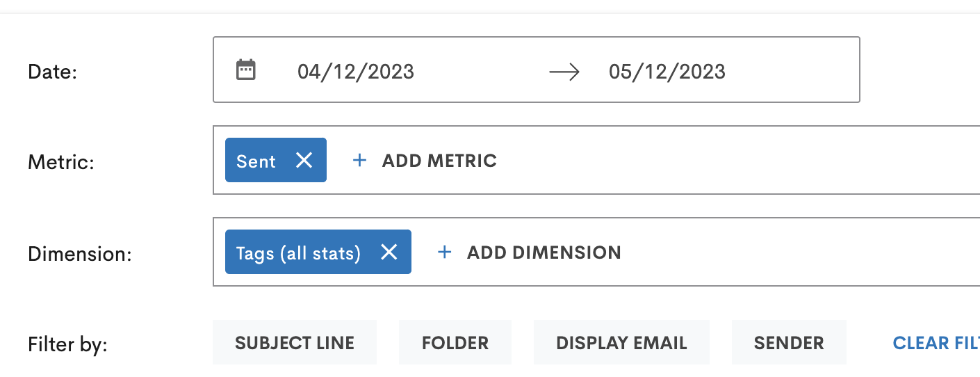
| Choose a date range to search by selecting a start and end date. |
Step 4: Add Metrics
| Add a metric you wish to view. |
Step 5: Add Dimensions
| Add one or more dimension(s) of the report that you want to see. |
Step 6: Choose Filters
Choose one or more filters to refine your report.
|
 |
Step 7: Generate Report
| Click Generate Report. |
You can name and save the report by clicking on the save icon at the top right of the page. You can export a .CSV file of the report by clicking on the cloud with an arrow icon at the top right of the page. |
Comments
0 comments
Please sign in to leave a comment.